Space Station

(

(

9

9

)

)

Brand Design project for the space theme cafe that focuses more at night rather than in the morning like other cafes.

TIMELINE

July 29 - December 25, 2025

ROLE

Brand Design

TOOLS

Figma

Illustrator

Nano Banana

TEAM
TEAM

Just me!

/

Overview

A nocturnal cafe, branded for the night owls.

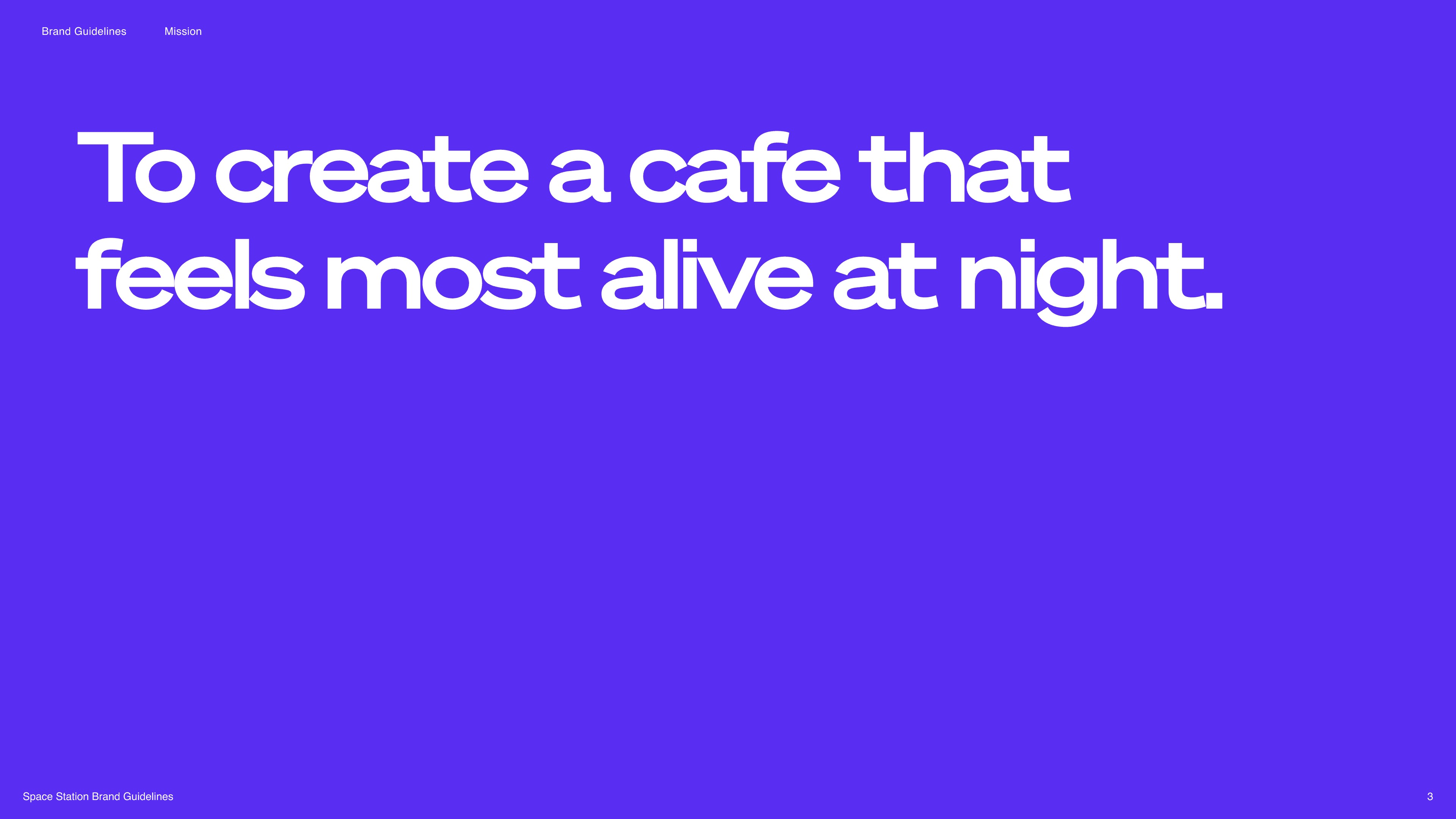
Most cafes are designed around the morning rush. I wanted to design the opposite: a place that feels most alive after dark, for people who want stillness at the end of the day rather than a jolt at the start of it. So the whole brand is built to feel calm and a little otherworldly, a retreat in the quiet vastness of space. Every choice after this point traces back to that one feeling.

We led the end-to-end design of a cohesive hardware-integrated ecosystem from scratch, focusing on democratizing home automation for mass-market users.

/

Overview

A nocturnal cafe, branded for the night owls.

Most cafes are designed around the morning rush. I wanted to design the opposite: a place that feels most alive after dark, for people who want stillness at the end of the day rather than a jolt at the start of it. So the whole brand is built to feel calm and a little otherworldly, a retreat in the quiet vastness of space. Every choice after this point traces back to that one feeling.

/

Process: the visual system

A deep-space palette that stays warm instead of cold.

The risk with a space theme is that it goes cold and clinical, the opposite of what a calming cafe needs. To get a mystic, fantasy-like feeling without losing the warmth, I anchored the palette in Nebula Violet and Dark Matter Purple, then paired it with the Söhne Breit typeface. That combination is where the brand lives: retro-futuristic energy on one side, human comfort on the other, balanced so the room feels adventurous and safe at once.

We led the end-to-end design of a cohesive hardware-integrated ecosystem from scratch, focusing on democratizing home automation for mass-market users.

/

Process: from screen to table

The Instagram grid is an extension of the room, not an ad for it.

I designed the social feed to carry the same atmosphere as the physical space rather than just market it. By styling my custom packaging and the signature "potions" inside a curated Instagram grid, I made sure the nocturnal vibe holds whether someone is scrolling a "Today's Album" post or holding an Alien Financier in the cafe. The point was consistency across touchpoints, so the brand feels like one continuous world from phone to table.

/

Reflection / refinement

The vision got sharper through critique, not in one sitting.
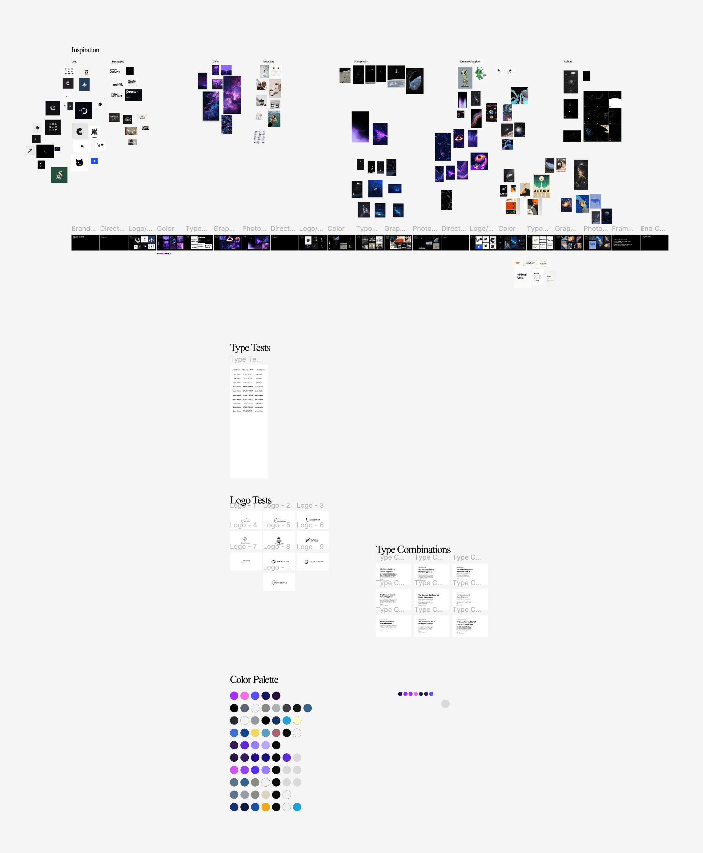
The final identity came out of a real feedback loop inside the ilovecreatives community. To land the exact night-owl atmosphere I was after, I worked through dozens of typography combinations, color palettes, and retro-future references, getting peer critique at each round. That cycle of testing and revising is what pushed me past the obvious space tropes and onto a system that feels nostalgic and futuristic at the same time. The lesson I keep from this one is that a strong brand isn't a lucky first idea, it's the survivor of a lot of honest critique.

We led the end-to-end design of a cohesive hardware-integrated ecosystem from scratch, focusing on democratizing home automation for mass-market users.

/

A nocturnal cafe, branded for the night owls.

OTHER

PROJECTS

Get in touch