Work · Drift • Concept 2026
An Apple Watch app that shows how time feels
- Problem
Health apps count steps and sleep, but nothing tracks how time feels. For people with ADHD, that sense bends more, and it makes every day harder.
- My call
We cut anything that makes losing track of time worse. No live readout, because it invites checking. No scores or streaks, because they turn into shame. Drift is a mirror, not a scorecard.
- Result
A FigBuild 2026 concept made in three days. It was never built, and user testing comes next.
- Role
Lead designer and design engineer, working with Christian Lee.
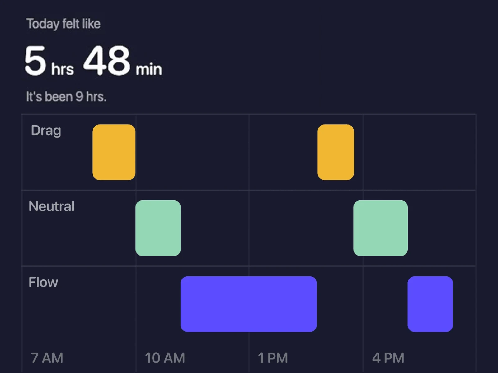
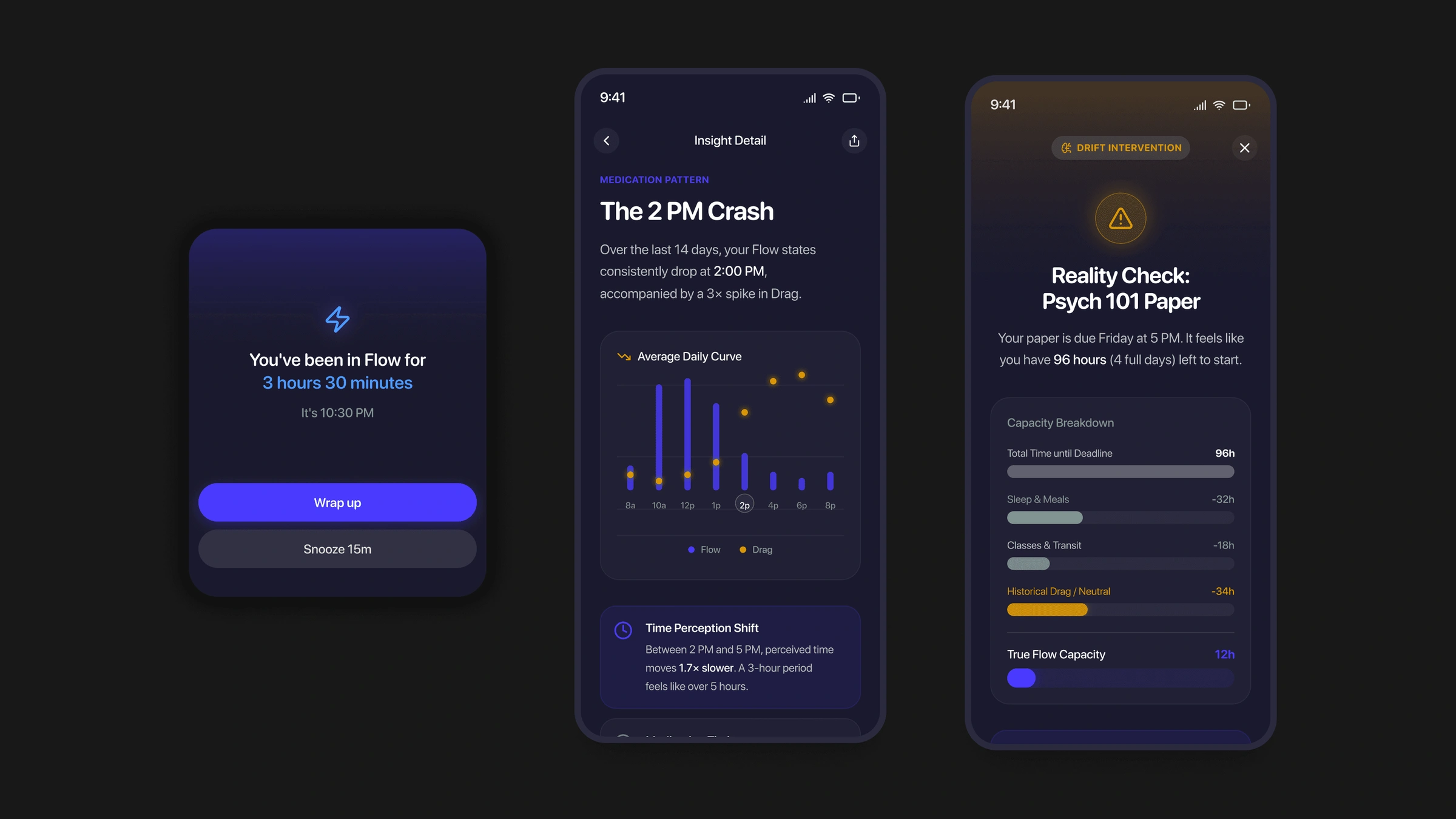
One day in three states, then how long it felt. 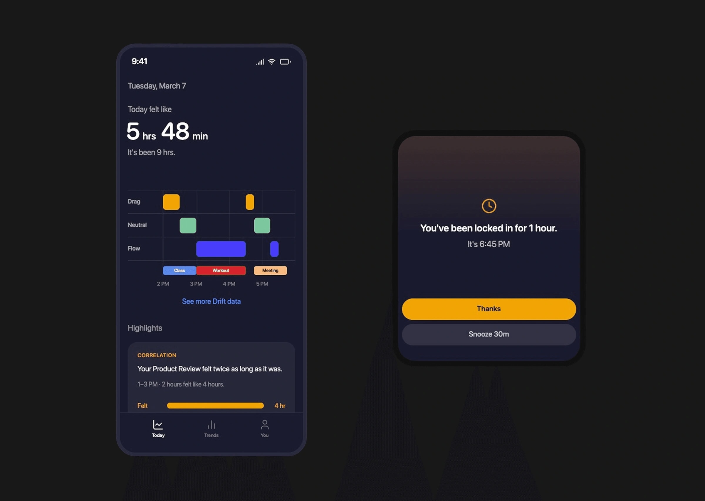
A gentle Watch nudge, and the day at night. 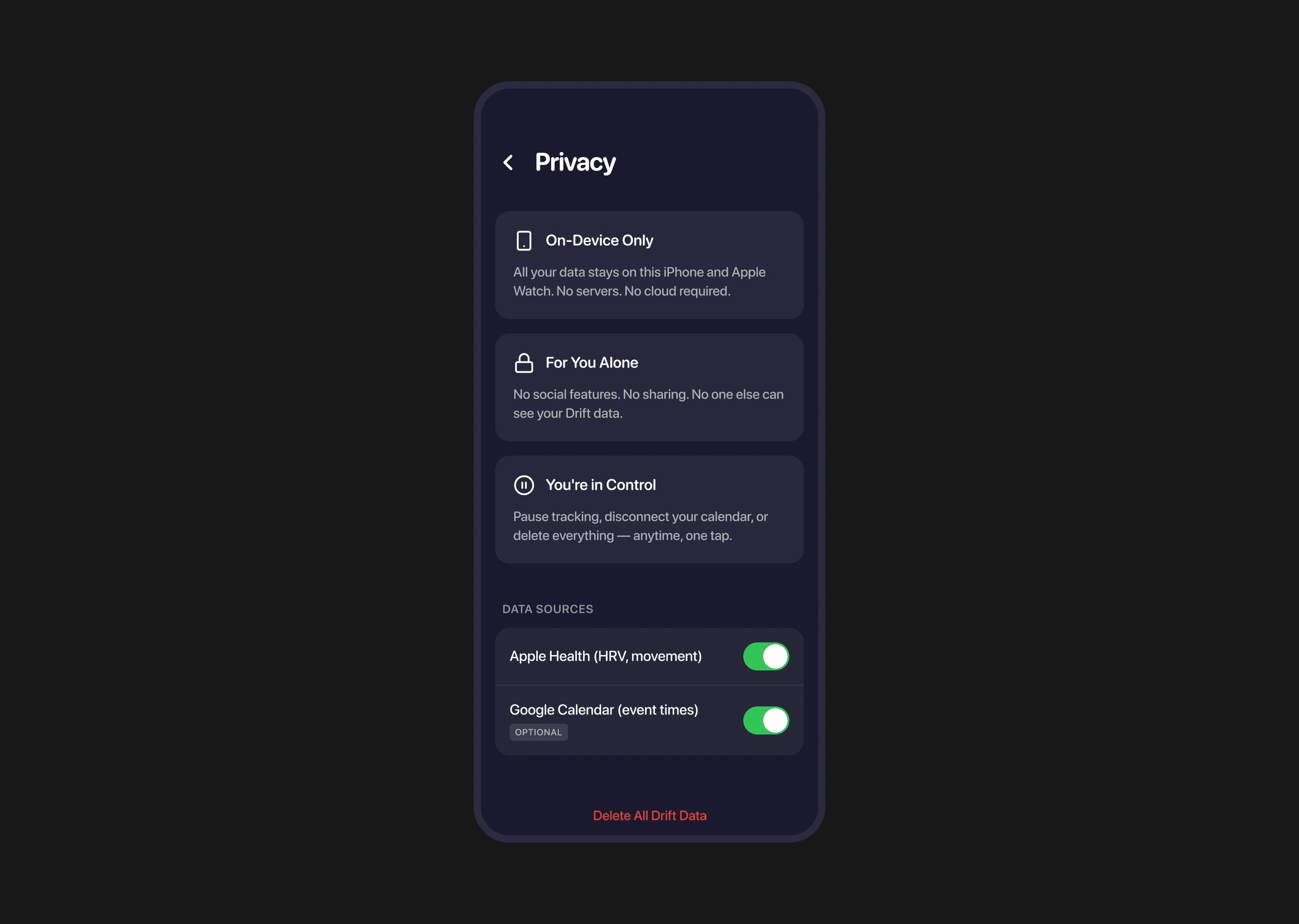
All data on the phone, every source a toggle.
- Role
- Lead Designer, Design Engineer
- Timeline
- March 2026, three day sprint
- Team
- Christian Lee
- Tools
- Figma, Figma Make, Claude, Claude Code
- Client
- FigBuild 2026
- Status
- Concept
- From brief to submitted concept for FigBuild 2026
- 3 days
- Time states, Flow, Neutral and Drag, none of them good or bad
- 3
Problem
No app tracks how time feels.
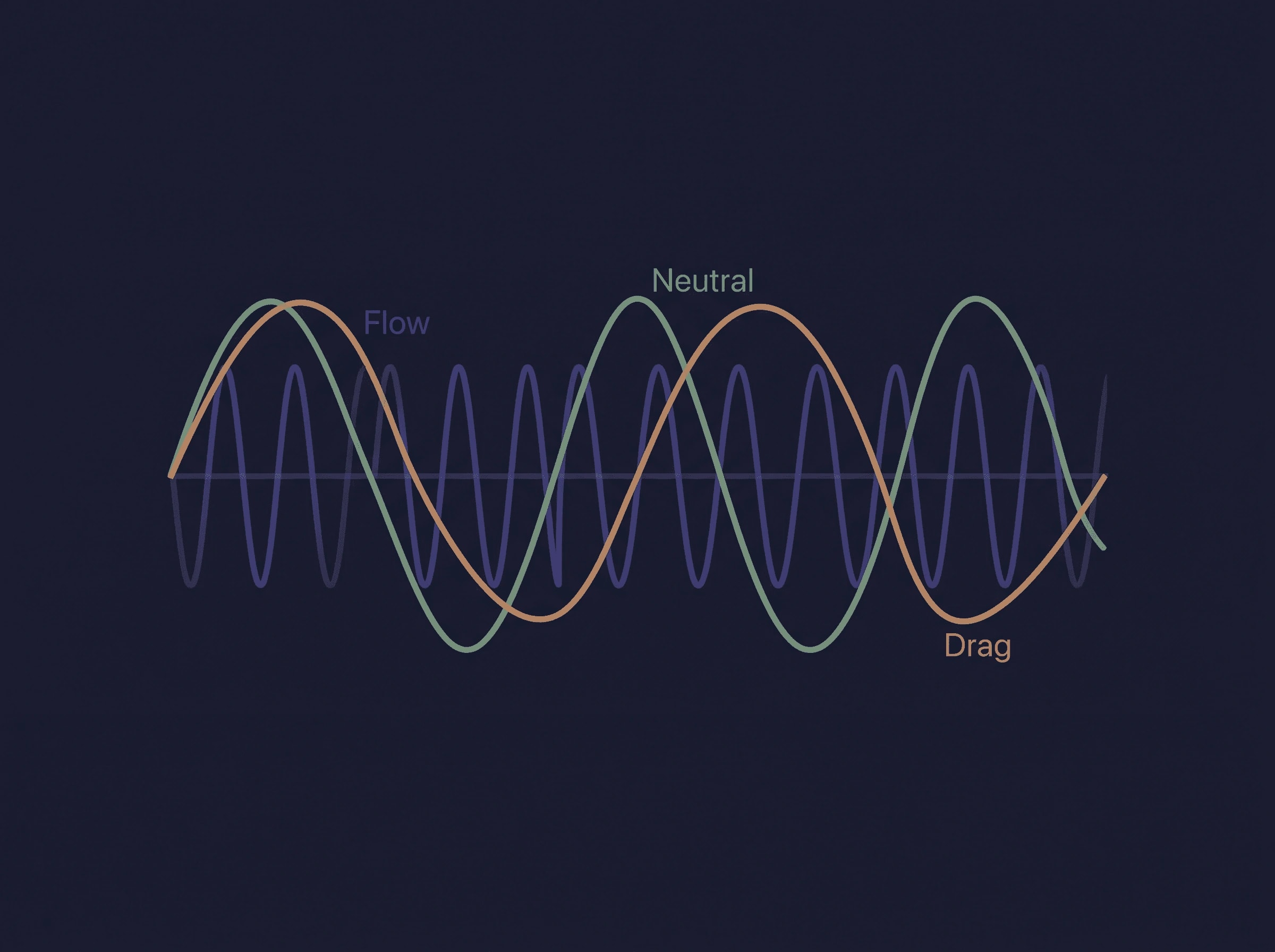
Health apps count steps and sleep. Nothing tracks how time feels. For people with ADHD, the brain's sense of time bends more, and that makes every day harder.
Process
Three time states, none of them bad.
Flow is when hours feel like minutes. Neutral is when time matches your sense. Drag is when minutes feel like hours. The rule: Drift is a mirror, not a scorecard. It shows you time and lets you decide what it means.
Process
We cut every feature that would make time blindness worse.
No live readout, because it invites constant checking. No scores or streaks, because they turn into shame. Reflection only at night, data stays on the phone, and a pause mode for hard days.
Each cut made the demo less impressive and the product safer.
Reflection
A three-day sprint can't prove the states feel true. Weeks with users can.
We started out thinking Flow was good and Drag was bad. Research turned that around, so Drift became a mirror, not a scorecard.
Next, I'd put the three states in front of people with ADHD for a few weeks.